Montag, 26. November 2012

Orly - Iron Butterfly

A while ago, I bought a couple of Orly polishes from a German online store that had a sale going on. Among those polishes was Orly Iron Butterfly from the Metal Chic collection. This collection consists of three matte metallics and it was Iron Butterfly that initially caught my eye. For a mere 5 € it had to be mine.

When they had finally arrived, I felt like doing a gradient mani with Iron Butterfly, a very dark grey, and its sibling Glam Rock, the coppery colored equivalent. The polishes are both unique in my stash. I love how they transform their looks when you apply topcoat!

Anyway, there's not much to add about doing a gradient, so here are a couple of pictures.


To add a little extra, I dabbed on some Nubar 2010 as well. Sadly, I went in a little too far, I think. I didn't want half the nail to be covered in Glam Rock... I love how Nubar 2010 shifts on the nail though. In case you're wondering, I added some topcoat to make it shiny. I liked it better that way. Aside from that, both Orly's were very nice to work with. They dry quickly, but not super fast, so you have a liiittle bit of time to correct application.


What do you think about this? I really like gradients. They're easy to do, are not very time-consuming and still look fabulous. Nice for those days when you don't want to smell polish/polish remover a lot...

Donnerstag, 22. November 2012

Priti NYC - Queen of the Pink Hyacinth (Swatch)

It's time for another swatch post! Today, I'd like to show you a couple of pictures of yet another Priti NYC polish. In my opinion, a very interesting polish. I bought it in a set at TK Maxx a while ago and I didn't think I'd like it as much as I do. But the finish changed that. Please take a look at Priti NYC Queen of the Pink Hyacinth, a light pink with strong coral undertones and silver shimmer.


From the bottle, I thought this one would have a frost finish and that's not really my favorite kind of finish. But it translates differently on the nail. Due to the shimmer, there are some visible brushstrokes, but they are not very noticeable. What I loved the most is how this polish looks depending on the light! This polish dries rather glossy, but depending on the light, it looks as if it has a velvet finish. In other light, the silver shimmer takes over and it does look frosty... But since it doesn't show many brushstrokes, I'm totally fine with that!


This was probably the most surprising shade from the set I bought. I like the finish, the color and that it actually looks quite nice with my skintone. Corals aren't easy for me to wear. But I like this one. Formula-wise I can't complain. Most Priti NYC polishes have a very nice formula and apply smoothly. I don't remember whether it dried quickly or slowly, but I judging from me not smudging it... not bad.

Do you like shades like Queen of the Pink Hyacinth?

Mittwoch, 21. November 2012

Fall into Autumn 13: Fall Flair

With this post, I'll finish yet another challenge. Time sure goes by... 13 weeks for the Fall challenge and they're over already! But I don't really feel sad, because the next challenge is just around the corner and I'm looking forward to this one as well!

So without much further do, here's theme numero #13: Fall Flair. Actually, I had no idea what fall flair is supposed to mean... I still don't. But on the challenge chart it said "your choice" in brackets and that saved me somewhat. I decided to experiment a little, and luckily, it turned out quite nicely!

Last year around this time, I got two bottles of flocking powder I intended to use on a craft project I never realised in the end. Even though flocking is nothing new, I still hadn't tried it despite having the materials at hand. With this challenge, I wanted to change this fact.


I started without any plan what I wanted to do, so I just pulled out the flocking powder, chose matching polishes from my stash: Misslyn Copper Twist (chocolate brown, imo...) and 
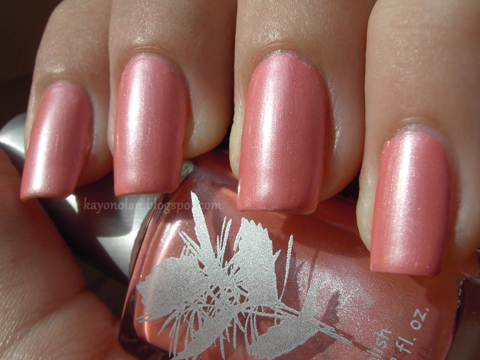
Woo 665. Don't ask me why I bought brown flocking powder. I think they only had those two colors left and they were on sale or something. But it matches fall... Anyway, I painted my nails with one coat of those two polishes and started sprinkling the flocking powder on top. It worked better than I thought! It's a messy process though. Clean-up is a bit tricky... sorry for the flocking around the cuticle area.


But in the end, I was left with flocked nails and no idea what to do next. After a while, I just started putting nail polish on top of the flocking and that actually looked nice! I used a dotting tool and tried to paint little leaf shapes. Afterwards, I added some details in matching colors, the two base colors, China Glaze Riveting and a mixture of OPI The IT-Color and Catrice Browno Mars. Yes, the same I used for yesterday's mani. I still had them on my table.


I carefully topcoated my leaves with essence BTGN Top Sealer and my dotting tool to make them a little bit more shiny and blend the colors together. I was quite satisfied with the result. It looks like the leaves are floating. The texture of the flocking underneath adds something very interesting to the overall look. Not sure if I'd liked it as much with simple polish as my base.


The flocking was weird on my nails. I'm used to matte polishes, but flocking is different... it's not in the way, but I kept touching to make sure those are my nails. Sadly, I had "tipwear" quite fast... The flocking disappeared and I was left with the base color underneath. At least, not very visible "tipwear".


What do you think about the results of my little flocking experiment? Have you tried flocking powder? What's your opinion?


Dienstag, 20. November 2012

Fall into Autumn 12: Harvest

So here's another manicure I did for the Fall into Autumn Challenge. Only one more theme to go and it's the Winter Challenge already! But before that, I have got to show you my harvest mani.

I really wanted to do something inspired by my work&travel experience in Japan. But that turned out more difficult than I thought. At first, I wanted to do cabbage inspired nails. We would cover them in newspaper to store them. Sounds like a nice twist to a green mani... but then there was work and I was too tired to tackle the newspaper technique. Then I thought about the Kaki strings we would do. I have no idea if other countries do it too, but in the region I worked at, they would kind of sew Kaki fruits to strings and hang them in front of the windows to dry them. They are supposed to get moldy with a special kind of mold. I didn't get to see that, but I spent some days preparing those strings. But... no nice Kaki orange in my stash.

And then, there was the buckwheat harvest. That was actually quite fun because we did it in a big group. I'm not happy with the result of this idea, because you can't tell that it's buckwheat. But it looks like harvest, so mission accomplished.


My basecolor for this mani is Color Club Earthy Angel. The shade doesn't go with my skintone, but it seemed nice for my buckwheat field. I continued sponging the lower half of my nail with China Glaze Riveting, BeYu 084 and a tiny bit of OPI The IT-Color. I just got Riveting in the mail and I'm soooo in love with it! Gorgeous polish!


Next, I'd take my tiny brush and a piece of sturdy paper on which I put a couple of globs of Catrice Browno Mars, OPI Glitzerland and Color Club Rebel Spirit. I swirled them together to get a couple of shades and painted tiny stripes to form the buckwheat bundles and the rope around them. That's it.


I messed up the clean-up on my thumb. Didn't manage to do that in quite some time... In case you wonder why the pictures look slightly different than usual: My dear photoshop decided to act up a couple of days ago, so I had to use a web-based editor to work on my pictures. I hope I'll be able to solve the problem soon!

Until then... more swatch posts to come!
Take care and 'til next time!


Samstag, 17. November 2012

Schleifchen und Pünktchen (again)

Lately, I have been going through a couple of my old blog posts, looking at the design I posted back then. I didn't change my polish/nail art as often back then and I still feel like I accomplished some great designs. But I realise that quite a bit has changed since then. My nails are way longer, I actually try to take care of my cuticles, but most of all, after one and a half year of nail art, I feel like I can do better with my paint brushes.

I had been eyeing one of my old designs for a while now: Schleifchen und Pünktchen. I really liked it and, actually surprisingly, it's currently in the top10 most viewed posts. I felt like wearing something cute again and had a couple of matching polishes on my desk: so here is a retry on this particular design. I didn't change much!


The only significant polish I changed is the white shimmery base. Instead of essence diamonds and pearls, I used W7 Polar Bear. I just had it on my desk and it's an untried, so this was decided. The other polishes are the same: p2 elegant for the tip, Manhattan 51K and Catrice Sweets of my Sweets for the ribbons. The black I used for the dots is essence black is back.


Since I wore W7 Polar Bear for the first time, I didn't know how it would behave. It's actually quite sheer. What you see here are three coats and it could have used a fourth on some nails. Luckily, it's not only sheer, but thin as well, so three coats didn't  make my nails look thick.


After painting my tips with p2 elegant, I dotted the edges with Manhattan 51K to start the lacey part. All of the lace was done with this dotting tool. One of the advantages of longer nails is certainly the increased space to paint on. I couldn't have done the lace part like this last year. It'd have covered up 1/3 of my nail.


Last time, I drew the light pink parts of the bow first and later outlined it with the darker pink. I did it the other way around this time, because it's easier to control the size of the bows that way. It worked fine - maybe due to increased brush control. The final step was adding my black dots to the tip. Well... I didn't get much better at this.


My final thoughts about this... I like the black dots in my first manicure way better. They're much more delicate. But I like the pink details better here. That's partly because of the space I had at hand this time. And even though I wasn't sure about it at first, I like Polar Bear better as the base color.

I still feel like I'm neglecting one of my favorite polishes. p2 elegant is a beautiful color and I really think I'm going to do a swatch post for this polish (even though it's discontinued). I haven't worn it since the first dots and bows mani! That's certainly the downside of being a nail polish collector...

Which one do you like better? First of second version?

Donnerstag, 15. November 2012

Priti NYC - Oleaster (Swatch)

Today, I finally want to post my swatch pictures of Priti NYC Oleaster. I have already used this in two manicures. One of them was the Cloudy Days mani from the Fall into Autumn Challenge. I wasn't sure if I like this color at first. It's muddy, grey and not very pleasant looking. But well, it wasn't even true fall yet, when I bought it. Right now, this kind of color is everywhere when I look out of the window.

Priti NYC Oleaster is a grey with subtle green undertones that dries to a semi-matte finish. I played a bit with this polish while swatching. On two coats of Oleaster, I applied a matte topcoat on my index and normal glossy topcoat on my ringfinger. As you can see, the original finish of Oleaster is somewhere inbetween.


The matte topcoat makes it more greyish, the glossy topcoat a bit more green, in my opinion. I prefer Oleaster's own finish. It looks the most interesting to me. Mattified, I find it a bit too dull and with glossy topcoat, the shade is nothing special anymore. I'm not even sure I like it with my skintone. But I do when it's just left alone. Weird, hm?

Application and drying time are nice. I didn't know Oleaster was a semi-matte polish when I bought it, so drying time might have been a little faster than anticipated.:D

indoors


What do you think of this polish? Would you have bought it?

Dienstag, 13. November 2012

essence - Alice had a Vision-Again (Swatch)

As I mentioned before, I'm running a little low on nail art to post since I broke my left pinky nail. It kind of discourages me, because the rest of the nail is so tiny... (imagine the pinky nail down there with only half the length...) But I have tons of swatches to post, so I'll increase their share for the time being!

Today, I want to show you a couple of pictures from a recent polish by essence. It belongs to the breaking dawn - part 2 LE. I'm not a fan of the movies, but I like the polishes essence released in connection with them. I only bought two of the four polishes from this years' edition and one of them is called Alice had a Vision - Again. It's a dark purple jelly based polish with lots of purple and a few teal flecks. A real beauty in the bottle! I didn't plan on buying it when I saw the promo pics, but when I saw it in the stores, it was instant love.


The three pictures above where taken in my tiny DIY lightbox. They show how packed the polish is with flecks. You're seeing two thin coats here. The lightbox pictures were taken when I wore the polish for the second time, so I knew what I'd be dealing with. Alice had a Vision - Again is rather goopy, but still runny enough to gather at the sides of the nail if your coats are too thick - which happened when I wore it the first time.


These two pictures are from the first time I wore it. I applied two coats as well, but they're rather thick. Also, those pictures were taken in the sun. Aside from being on the difficult side, this polish is also rather slow-drying. That's why I had to take it off the first time. I smudged it soon after I took my pictures.

As I said, Alice is really pretty in the bottle. But on the nail, it doesn't wow me as much. It is pretty and I'm glad I got it. But it doesn't meet my expectations at all. I don't know, maybe I hoped it would have a little more depth. Despite being a jelly, it looks... flat to me. That's why I decided to try pimping it a little when I wore it for the second time.


I just added two coats of Kleancolor Chunky Holo Purple on top of Alice had a Vision - Again... and liked it a lot better instantly. Of course, the teal flakes got lost that way. They're way too subtle against that bright orange.

What do you think of this polish? Have you bought it yourself maybe?

Sonntag, 11. November 2012

H+M - Blue

Hello everyone,

I hope you're all having a nice weekend. Mine is almost over, but before it is, I want to add one more nail art post to my little blog.

This mani wasn't planned at all. It just happened after I swatched the base color and found it so pretty that I decided to keep it on. I'll include some of the original swatch pictures at the end of this post.

The polish that I used as the base for this mani is from a mini-set by H&M and it has the awesome name "Blue". I'm always amazed by the creativity of H&M naming their mini-sets with names like that... The other polishes in this set were named "Pink", "Red" and "Black"... Anyway, it's a nice blue, somewhere between medium and dark blue. It's infused with silver shimmer and it reminds me a bit of a summer night sky. It's a bit sad that Blue is only a mini polish, I like it a lot!


After I had decided to keep wearing this polish for the time being, I wanted to add a little to that night sky feeling by adding some sparkles to it. What better polish could there be than Barielle Starry Sky? I hadn't used it before, but the glitter in this one was just as sparse as I hoped it would be. It's simple silver hexagon glitter in a transparent base, but  doesn't it look like stars on the blue?


I continued with a new attempt on the one stroke technique to paint the flowers. It worked okay, but this attempt made me realise that maybe my low quality acrylic paint is one reason for the gradient not being completely blended. I think I'm going to order a nice set of higher quality acrylic paints some time soon. I painted a couple of different flowers to practice different brush movements.


On ringfinger and pointer, I used two sizes of rhinestones to create curved lines. The silver rhinestones are 1mm, the aqua ones 1,5mm in diameter. I didn't topcoat them, because those rhinestones tend to get dull when I do. They stayed on longer than I thought they would. In the center of some flowers, I added a couple of matching bullion beads. Those were topcoated and actually didn't blead this time.


What do you think? Do you have any brand you can recommend me for my new acrylic paints?

And to finish this post, here are two pictures of H&M Blue all on its own!


Samstag, 10. November 2012

p2 - night out (Swatch)

Today, I'm back with a post from my ever-growing pile of swatch pictures (for now). If I feel like it, I might add some nail art related post later. But I really have to count those now... because... I broke a nail. So badly, that I'm not sure if I want to post new nail art aside from those for the fall challenge. It broke below the visible nail line and hurt like hell. At first, I tried to glue it back on (you might have spotted that in my dotticure from yesterday), but that wasn't as stable as I hoped. I'm glad I got to take my pictures... I'm left with five sets of nail art pictures (and a lot of swatches). I hope my nails decide to grow a little faster than usual now, that all the weight on my fingertips is gone ^^;

So for the time being, here's a swatch of p2 night out. It got discontinued when the new line-up was introduced, but I find it pretty enough to still write a post about it. It's one of those polishes that I kept staring at in the store, but never went ahead and just bought it. When I heard that it would be discontinued, I finally took it home with me.


A lot of people described night out as blue shade, but to me, this is a greyed purple. Greyed blurple at most. It's a nice and somewhat elegant shade, because it's not so in-your-face as a lot of other purples. I love those a lot though. But night out seems to be a nice fall shade. I wonder why they recently removed it from the line-up. I probably would have done so in spring... but in fall?


Application was really nice for this one. Two coats do the job and drying time was okay too. p2 used to be my favorite German drugstore brand. They had some awesome polishes and the formula was way better than the formula of any essence polish back then. I have no idea what happened, but p2 suddenly lost a lot of attraction. I know that I'm not the only one thinking that. Their polish line-up got boring, whereas the essence one got more and more attractive. When the formula of essence polishes got nice too, I kind of stopped looking at the p2 display.


Their new line-up seems promising. I hope they'll continue to sell interesting polishes as they did before.

Have you tried p2 polishes before? What do you think of the brand's polishes?

Have a nice weekend!

Freitag, 9. November 2012

Fall into Autumn 11: Autumn Dots

It's Friday already and I have been home sick for seven days now... and still not feeling better. And I really have been resting... :( It was convinient for my sister though. She's going to hand in her bachelor's thesis next Monday and since I was sick, I had enough time at hand to proofread it for her. It reminded me so much of my own diploma thesis two years ago. I have to admit though, that her topic was a bit more interesting than mine, hehe.

But I also didn't neglect my nails and did some easy nail art. I said I would catch up with the challenge this week, so one of the manicures was a dotty one for theme No.11: Autumn Dots. I already had a pretty clear idea what I wanted to do, but I still searched the net for some pretty color combinations. I found one that seems to have inspired at least one more lady from the challenge group. It just proves that it is a nice combination!

So here's my retro autumn dotticure:


I'm really proud of myself, because most of the polishes I used for this mani are neglected ones or even unused polishes. I used a total of six different polishes for this.

I started with three coats of essence frosted champaign from the crystalliced LE from last winter. I don't remember if I wore this before. It's a light beige with golden shimmer and some really tiny random red glitter pieces that really irritated me. Frosted champaign levels nicely, but even at three coats, it was not opaque. It seemed to enhance the white tip. I stopped at three coats, because I'd cover up a lot with my dots anyway.


gloomy daylight
 For my dots, I picked five different shades from my stash. OPI Stranger Tides and essie Sew Psyched (green), p2 Honolulu Juicer (orange), Milani Foxy Lady (red) and p2 night out (blue). I think they look nice together.

I used two different methods to place my dots. At first, I'd go color by color and place random dots to create a random color pattern. That didn't work that great as you can see on my ringfinger. The lines are a bit wobbly. Later, I'd do row by row. That involves more polish, but the lines look prettier.

Which one do you like better?


I got some nice comments on these nails and I really enjoyed wearing them. Enough to not paint my nails for three days straight even though I had time to paint them. It was weird to have a pattern like that on my nails. I kept staring at them, thinking I had something odd on my nails. :D

What do you think of my dots?

Please take a look at all these awesome manicures too:

Related Posts Plugin for WordPress, Blogger...